We’re taking OnStrategy’s new look down the runway.
It’s been a behind-the-scenes project for several months now – we’re excited to unveil OnStrategy’s bold, fresh new look. So, here it goes!
Hey there, color. Nice to see you.

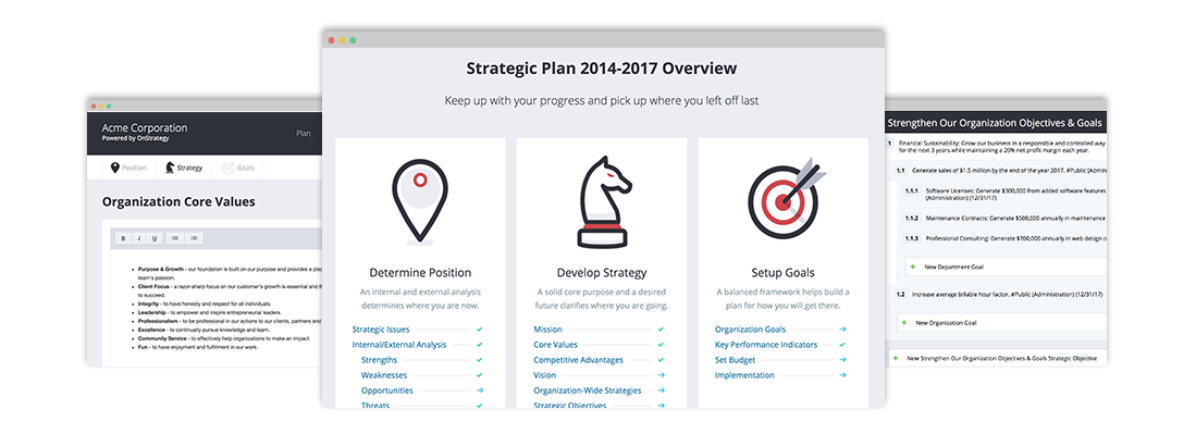
When we embarked upon this journey, we looked at the app. One of the things we always hear from clients is how they loved the clear contrast so they can see what needs their attention.
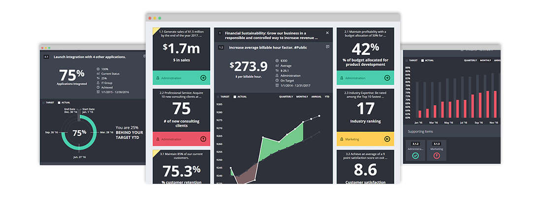
We’re embracing this concept by brightening up our colors and pushing up the contrast. While most of the colors within the app have changed, you will notice these four colors the most as they are used as the new status colors.
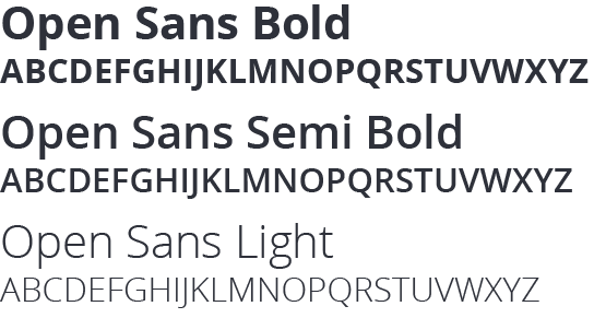
We Love the New Font
It’s Open Sans for all you typography lovers. It’s clean. It’s elegant. And, above all else, it’s easier to read.
A Modern Touch
You might not be able to notice right away. But we’ve squared up our corners and flattened our design elements. It’s made the app an easier read, decreased page-load time, and given it a modern look.
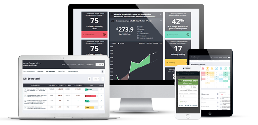
Just look how awesome it’s turned out: