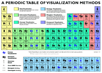
Most might hesitate to call the periodic table of elements a thing of beauty, but the manner in which it manages to succinctly communicate and categorize the essence of all known elements in our world in such a humble design demonstrates a masterfully informative graphic. Thankfully, this article isn’t a flashback to high school chemistry.
Through our experiences in strategic planning and market research, we know the lack of a clear, effective communication to stakeholders can create a significant obstacle to implementing a plan or customer program in your organization. So it is refreshing to see the periodic table model changed to convey different categories and elements of data visualization from the minds over at www.visual-literacy.org.

The table captures visualization in six key modes of application: Data, Interactive Information, Concept, Strategy, Metaphor and Compound. When you cursor over the “elements” of each mode, you will see examples of cobwebs, cause and effect chains, failure trees, story boards, process road maps and more. In all, this is the most comprehensive interactive map we’ve seen on using visualization to communicate complexity with simplicity.
The next time you try to relate important yet complex information, we believe it is worth the extra investment to weave visual collateral into your project. In doing so, here is some guidance to make sure the intersection of creativity and messaging keeps the information conveyed as clear as possible:
- Begin with the end in mind: What do you want the viewer of the info graphic to clearly understand? Stay succinct with what the overall picture needs to say throughout the process.
- Get elemental: Think of your information as nuggets that may both “belong” to a category, but have mobility as well. This will open up the creative process.
- Make it fun and easy on the eye! If spreadsheets did this effectively for communication purposes, we wouldn’t have had to write this article, or develop OnStrategy for that matter!
Remember, visualization is intended to communicate the complex in a quick and apparent manner. Capturing the elements and essence of complex plans is key to widespread strategic implementation, as well as ensuring your stakeholders can clearly see the “big picture.”
StrategyCheck
How are you telling your stories?


This is an amazing compilation of ideas. What is the software tool you use to create graphic depictions of plans?